Another Montblanc I didn’t buy…

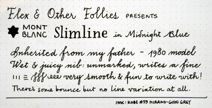
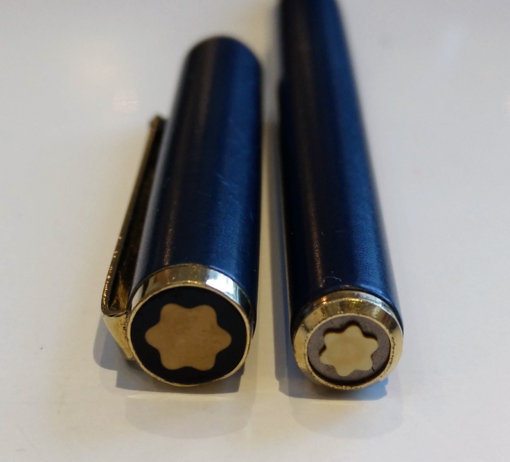
My mother gave this to my father almost forty years ago and it has made its way to me after not being used for most of the intervening period. (I guess it’s sensible to keep expensive pens away from the kids.) For such a slim pen, it has a total of four(!) Montblanc stars on it: one on the nib, one on the clip, and one on each end of the pen.
There is a model without the star on the clip (the Noblesse) and that has a gold nib. The Slimline, on the other hand, has a gold-plated steel nib. While I have never tried the Noblesse, the way this Slimline writes makes me feel that Montblanc certainly were doing something right: this is a joy to behold.

It seems to be a common complaint about modern Montblancs: that their nibs are very average and that the way to find a good nib is to go vintage. My admittedly fairly limited experience with Montblancs definitely bears this out; having tuned an old Montblanc 32 and tried some modern 146s and 149s, I can safely say I enjoy this pen far more than the far more expensive Johannes Brahms I wrote about last week.